Kill Helvetica
Against default typefaces
In the beginning were the grotesques.
They were called grotesques because to the elites of the late 19th century, they were. No serifs. No italics. No adornment. Just bigass block characters meant for disturbing new typographical use cases: advertisements, printed tickets, industrial signage. The steampunk machine god that slew Victorian propriety and differentiation issued its edicts in Akzidenz-Grotesk: “Commercial-Use Grotesque.”
Max Miedinger took that ethos seriously when, more than half a century later, he developed the typeface that became Helvetica. He was among the International Typographic Style—the Swiss Style, commonly. These people were capital-M Modernists. The believed in technological utopia and the value of using modern technology for aesthetic purposes. But unlike the 1920s counterculturalists of Constructivism, de Stijl, and Bauhaus, the Swiss typographers tried to be mainstream. They believed in grids, in geometric design, in the new artform of photography, in form following function, but they weren’t ideologues about it. The pure-Bauhaus typeface Futura lives and dies by its geometry, even at the cost of readability. It’s a pain to use as body text.
Helvetica, by contrast, never fights with its users, by design. Max Miedinger specifically wanted a readable, usable typeface suitable for commercial use. Clean. Flexible. Neutral.
How to Become the Default
Very few typefaces work well as both heading and body text—the typographical details that make small text readable in paragraphs look washed out in big letters atop distracting graphics. The flourishes that can stand up to such heavy-duty eyeball capture become overwhelming in fine print. Helvetica is special in that it does everything—narrow, wide, large, small, street sign, computer screen. It rarely looks exciting or high concept—I personally only like Helvetica’s look when it’s stretched to its extremes—but it never looks bad. I can write this essay on my phone, without my glasses, in Helvetica, without straining my eyes.
This flexibility of use enabled Helvetica to be used on anything, not just the ads, tickets, and signage of its grotesque forebears. As the typeface for the New York Metropolitan Transit Authority, it blends into the mud-smeared color-coding of daily commutes. As the base for corporate wordmarks, it can change association through mere changes in color. And because it works well enough as body text, you don’t need to break your brain and budget trying to license two typefaces that somehow present a unified front for your brand identity.
This flexibility of form applied to licensing, too. Linotype licensed Helvetica to IBM, Adobe, Xerox, and Apple in the ‘70s and ‘80s, before people really believed this “personal computer” thing would catch on. And designers found that Helvetica worked just as well on printer paper and CRT screens as it did on every other commercial application. Because it was clean, flexible, and neutral.
It was a perfect default typeface.
The Image of Max Miedinger
Of course, Helvetica’s influence stretches beyond itself. Venerable Arial is a clone of Helvetica, but such a statement understates both the impressiveness of the clone and the additional functionality layered on top. Robin Nicholas and Patricia Saunders designed Arial to have the same per-character dimensions as Helvetica, meaning that switching from Helvetica to Arial, from Macintosh to Windows, from Linotype-Hell AG to the Monotype Corporation, is utterly seamless. Try it: nothing moves. No line breaks change. Your typographical switching costs are zero. Sure, Arial looks less sharp, less clean, more lame, but in return, it’s more durable against degradation.
Arial remains readable at low resolution, on compressed-to-pieces rasterizations, when resized to the wrong aspect ratio. And it proved cheap. It was packaged on every Windows machine from its inception and set as default on nearly every computer application and webpage. It became the Starter Font for every amateur project, rush job, and C-tier software that couldn’t bother to change it. Arial carries its mandate as the digital default into 2025, serving as the flagship typeface for Google Workspace, the lowest-common denominator productivity suite for Gen Z, now that Microsoft 365 has locked its Office Suite behind a frustrating paywall.
More than most typefaces, Arial remains functional even when deep-fried. It’s clean enough to shoulder digital compression, flexible enough to survive misuse, and aesthetically neutral like the typeface it clones. If anything, Arial looks wrong on the high-resolution graphics and clean signage favored by its antecedent. And for this reason, it deserves its mantle as the digital default: the typeface for people who hate typography.
New Helveticas
Few digital typefaces truly die once sunk into default libraries, but the original Helvetica is increasingly outmoded in favor of newer iterations. The straightforward replacement is Helvetica Neue, a nip-and-tuck that yet widens the flexibility of this typeface. The ultralight and extra black Helveticas that I like are really features of this v2.0 product.
But the more interesting replacement is San Francisco, the default “Sans Serif” typeface for Apple products. Unlike Arial, it does not explicitly match Helvetica, beat-for-beat. Instead, it morphs. It changes its spacing, character choice, and even fundamental outlines depending on context. It does so because unlike the Helvetica typeface it still emulates, it is fundamentally unmoored from the physical realities of typesetting, printing, and even displays. No mortal eyes see San Francisco: its true form is a library of vectors, each character parameterized to respond to digital inputs, its true name redacted in iOS system settings. It is clean, flexible, and neutral enough to bury the whimsy of Jony Ive’s design legacy.
The Wrong Typeface for Reindustrialization
This history underpins my disgust at the use of Helvetica and other Swiss-style neo-grotesque typefaces in the visual language of the Thiel-pilled, Tech-Right, The Gundo-based, #Reindustrialize movement. This cohort of founders, engineers, and policy analysts—a cohort I have sought political coalition with—has adopted a unified aesthetic language of Silicon Valley flat design kitbashed with pops of PCB-etched monospace, military-earth-tone colors, 1940s industrial propaganda, and anime kitsch. The most cohesive demonstrations of the aesthetic are the advertisements for nouvelle-défense startup Anduril, which merge low-cost minimalist vector graphics with aesthetic brainstems forged in the multiplayer lobbies of Call of Duty 4: Modern Warfare.
Yet Anduril’s typeface of choice is Helvetica. Palantir uses the contemporary rival Univers. The Institute for Progress uses Söhne, a riff on Akzidenz-Grotesk like Helvetica was. A review of these based and pilled “hardtech” companies reveals a panoply of neo-grotesque riffs on Max Miedinger’s work—a bit softer here, a bit more geometric there, all with the flat Modernist design language that has been the Look of the Future since the Swiss Style was born. On a superficial level, the underlying design brief of Helvetica matches the ethos of this nascent-yet-ascendant cohort. Form following function. New graphics techniques embedded in grid formats. Mathematical precision balanced against commercial necessity. Faith in the techno-utopia.
But the original designers of the International Typographical Style were true-believing liberal internationalists. The new right, by contrast, are not neutral. They are not internationalist. And their aesthetic tastes are not clean. The prevailing vibe is garish shirts, greentext, and mecha anime; redeemed into gilded Christianity, grotesque masculinity, and a reverence for the gross incandescence of a blast furnace.
Despite this mismatch, the #Reindustrialize cohort chose Helvetica. They chose Helvetica because it was the default typeface of the modern world. They chose Helvetica because it was so default that even the new defaults look like the old default. And if they didn’t choose Helvetica, it was because they wanted a Swiss-style neo-grotesque like Helvetica.
Short of Jonathan Keeperman, there are almost no artists or art critics among the current right. They do not know art, nor art history. As a result, their artistic influences are borrowed and scarcely transformed, with little mind paid to where those influences came from. The result is bland corporatism when they shop out their design, and kitchy Midjourney slop when they don’t. They don’t know how to make art, so they deride it as gay, and woke, and perhaps mere vibes enabling style-over-substance grifters. They do not know of a style of art that loves both high technology and masculine nationalism.
Yet such an art style exists.
They could have embraced Futurism this whole time.
A Neo-Futurist Typography
We have forgotten how immensely quickly technology changed at the dawn of the 20th century, before the World Wars. Within mere decades, the world saw the mass proliferation of telephones, phonographs, automobiles, aircraft, ocean liners, moving pictures, and mass-media newspapers. Our current sociopolitical convulsions in the wake of AI are—if anything—less extreme than what the world saw between 1900 and 1920. To the Italian poet Filippo Tommaso Marinetti, existing approaches to art, politics, and language itself were insufficient for representing reality. To this era, he and his artist buddies invoked the name Futurism. The Futurists declared war on the past and its institutional gatekeepers. In its place, the Futurists sought danger, passion, technology, warfare, and above all speed.
Marinetti focused on the literary, describing a poetic style he called words-in-freedom. Imagine: a friend of yours—bright, eloquent, high-agency—finds himself in a zone of maximum human experience: a war, a natural disaster, a thirty-six hour product launch. He’s telling you how it’s going. How would he talk?
He will begin by brutally destroying the syntax of his speech. He wastes no time in building sentences. Punctuation and the right adjectives will mean nothing to him. He will despise subtleties and nuances of language. Breathlessly he will assault your nerves with visual, auditory, olfactory sensations, just as they come to him. The rush of steam-emotion will burst the sentence’s steampipe, the valves of punctuation, and the adjectival clamp. Fistfuls of essential words in no conventional order. Sole preoccupation of the narrator, to render every vibration of his being.1
He’s locked in. He got heat in his repo. He’s on his seventh Zyn this morning. Let’s fucking go.
To Marinetti, syntax is a hindrance. Why bother with the “right” word if the “wrong” word is more direct? Why not describe a drone swarm as an orchestra, or call a rifle your waifu? Why waste time writing a sentence when a meme can condense a book and your impressions of it into a 20 kB GIF? Why speak in words at all if you can speak in tokens instead?
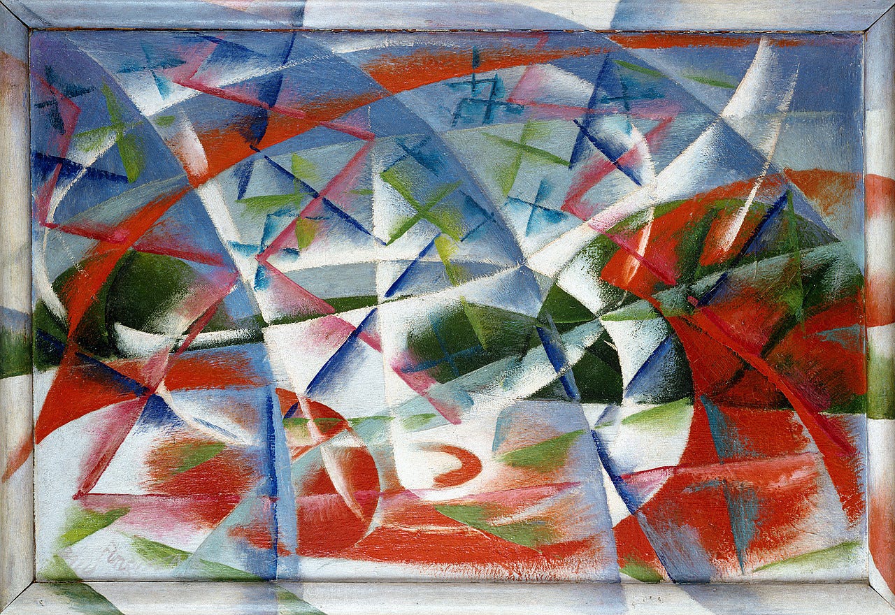
The painters of Italian Futurism made this ethos explicit: sharp lines, garish colors, paintings of cars and trains and heavy machinery, all portrayed as if the subject was screaming by at Mach 3, as if the heat from the exhausts could warp reality itself. The Futurists would have seen the eroticism of a GMLRS rocket battery. That feeling would have made it onto canvas.
And Marinetti had ideas for translating that feeling into typography:
My revolution is aimed at the so-called typographical harmony of the page, which is contrary to the flux and reflux, the leaps and bursts of style that run through the page. On the same page, therefore, we will use three or four colours of ink, or even twenty different typefaces if necessary. For example: italics for a series of similar or swift sensations, boldface for the violent onomatopoeias, and so on. With this typographical revolution and this multicolored variety in the letters I mean to redouble the expressive force of words. [Emphasis original]2
Typographical harmony is fundamental to Helvetica, a typeface specifically designed to get out of the way of both typesetter and reader. Apple’s San Francisco typeface seeks even greater harmony, towards a truly seamless digital interface. Marinetti would have the Tech Right veer in the opposite direction, to appropriate the digital tools that enable a maximally bouba typeface, and instead implement an equal and opposite drive toward the loud, the overbearing, the willfully ugly, the maximally kiki.
Of course, Marinetti was not only an Italian Futurist—he was an Italian Fascist, too. His enemies were not merely the Old Guard and its retrograde gatekeepers; he also named feminism, pacifism, and moralism as foes. I don’t necessarily consider this a reason to reject Futurism—in fact, the militaristic, authori-curious, lǎo dēng 老登 flavor of Futurism fits well with this new right. I personally find Futurism inherently exciting, and if nothing else, I resent seeking political coalition with people who have wack taste in art. I insist on better typography out of personal honor.
Creating An Anti-Helvetica
Helvetica was not conceived in a vacuum. It was originally named Neue Haas Grotesk—a “neo-grotesque” that explicitly riffed on the blocky, commercially-minded typefaces that were among the immense cultural shifts preceding Futurism. In such a fashion, a Neo-Futurist typeface can and should adapt ideas from prior typographical styles towards the new tools and use cases available to us in the age of artificial intelligence, autonomy-enabled warfare, and meme-driven politics.
From this new right’s technological underpinnings we find a deep love for software engineering—its luminaries from Peter Thiel to Marc Andreesen to Elon Musk all got their starts as software engineers, and the primary question of the day is artificial intelligence. Software programming has seen an evolution of digital typography largely parallel from digital graphic design. The monospace typefaces of computer terminals—Courier, Monaco, Lucida Console—draw initial guidance from the same twin mandates as typewriters: per-character readability within strict physical constraints. For typewriters, the uniform shape of each key forced every character, from “l” to “m,” to fit in the same character width. For software engineering, this comes from the mandate for lines of software to match perfectly from row to row—because unlike normal text, software code must be scanned up-and-down, line-to-line, not merely read like prose.
And from this new right’s 2010s heart we find the stylistic flourishes of meme culture—digital compression, pastiche media, greentext atop pink backgrounds, a neo-Dada aesthetic core that Julius Evola would have recognized from his own youth, that the Marquis de Sade would have wanted more from. As much as the ideological package of the Tech Right, of #Reindustrialize, rests on a canon of midcentury science fiction and counter-MBA business books, the emotional flame that brought Donald J. Trump to the Presidency comes from SomethingAwful and 4chan, from violent video games and YouTube Poops, from the barbaric glee of Elon Musk carrying a sink into Twitter headquarters in reference to a deep-fried meme.
In the same manner as Apple’s San Francisco typeface, a Neo-Futurist typeface need not care about the physical realities of type. It is allowed to be fully digital, to shift and twist, to embrace dynamic italics for similar or swift sensations, to take on boldface for violent onomatopoeias, to deep-fry itself so that it can redouble the expressive force of words.
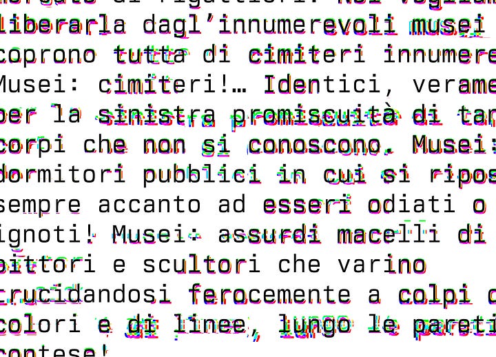
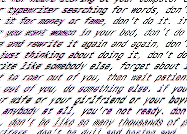
A Neo-Futurist art style would better match the Zyn-popping, heavy-lifting, 996-ing, agent-maxxing, hypermasculinity of the new right-wing, China-hawk, hardtech-shipping, Silicon Valley culture.
Political Movements Should Care About Art
I pitched this idea to some guys in a group chat, and they weren’t convinced. They were skeptical about the value of aesthetics in crystallizing Donald Trump’s ethos into a full-fledged ideological package that answers their purported challenges of deglobalization, mass immigration, falling birth rates, and industrial decay. They worried that a greater focus on aesthetics was in fact a focus on vibes, and that the introduction of vibes to national projects was an opening for grifters to enter the fray. That worry has history—consider the prominence on anti-fashion choices in Silicon Valley, like Marc Zuckerberg’s initial insistence on grey hoodies or Palmer Luckey’s continued insistence on Hawaiian shirts and flip-flops.
But this new right is not merely selling software—they’re building a new vision of The Nation. Their diagnosis of failures in the American project includes an assessment of moral and cultural decay, for which they blame feminists, LGBT activists, and miscellaneous intellectual traditions. If the culture was better, they claim, then the streets would be safer, the country more unified, and the children better raised. And as a hater of slop, I have sympathy for that claim. But in failing to make and fund better art, this Tech Right has accepted aesthetics scarcely modified from the B2B-SaaS-running, BAYC-purchasing, “tech bros” that the left accuses them of being. In failing to field aesthetic alternatives—in rejecting aesthetic escalation as vibesification bordering on deceit—they invite the accusation that for all their criticisms of the status quo, they lack better ideas.
Why don’t I hear about the DailyWire+ movie collection, even from conservatives? Why is there no contemporary music associated with Dimes Square? Why can The Menswear Guy throw around dunks on basically every right-wing influencer and politician except Michael Anton? Why is it just Passage Press selling interesting books (both classic and modern!) with beautiful covers? Why is it just Neil Panchal carrying the torch of cool typography for modern American Industrialism? Where are the poets, the painters, the musicians? Where are the people making the forward-looking, pro-American, pro-masculinity art that I’m told is missing? The answer, of course, is that there is almost no art in the ascending right, short of Ghiblification filters, Norman Rockwell memes, and borrowed glamor from Orthodox and Catholic art. But even the Catholic Church has a deep collection of increasingly conceptual contemporary art, including a room of Matisse pieces and a ragged abstract tapestry of the Crucifixion (in the Francesco Messina room) that’s so haunting and affecting that it appropriately prepared me for St. Peter’s Basilica.
Art is important. It is a vanguard for culture, a distillation of otherwise-formless human experience, a means of describing why one would pray, go to war, fall in love, or create something new. To forsake interest in beauty suggests a disinterest in culture, in language, in the erotic and the transformative. That is bad enough. But to bemoan cultural degeneration without offering a generative response is an insult to people with experiences and aspirations that cannot fit on a spreadsheet. It suggests that the ascendant right is merely a coalition of foul-smelling trolls and swagless Philistines. Even ascetics and barbarians seek beauty. That this based and pilled right is so careless with their aesthetic choices that their websites look identical to those of the ancien régime they seek to destroy does damage to the claim that they believe in a better culture, a better nation, or even God Himself.
I am in political coalition with these people because I seek the power to fix things in this country, and no one else is trying. But is an insult that they cannot produce better art about their politics than I can on a drunken Saturday night with my iPad. I must ask Raw Egg Nationalist and his ilk: is the right is lying to me about having a vision for a revived West, in the same way the left has lied to me about seeking the power to fix anything?
If not, why is Man’s World alone in the cultural sphere?
This writing reflects my views alone, and does not reflect the views of my current employer or previous employers. This is not investment advice.
Marinetti, F.T. “Destruction of Syntax—Imagination without strings—Words-in-Freedom.” From Apollonio, Umbro, ed. Documents of 20th Century Art: Futurist Manifestos. Brain, Robert, R.W. Flint, J.C. Higgitt, and Caroline Tisdall, trans. New York: Viking Press, 1973. 95-100.
Marinetti, F.T. “Technical Manual of Futurist Literature.” From Apollonio, Umbro, ed. Documents of 20th Century Art: Futurist Manifestos. Brain, Robert, R.W. Flint, J.C. Higgitt, and Caroline Tisdall, trans. New York: Viking Press, 1973. 100-106.


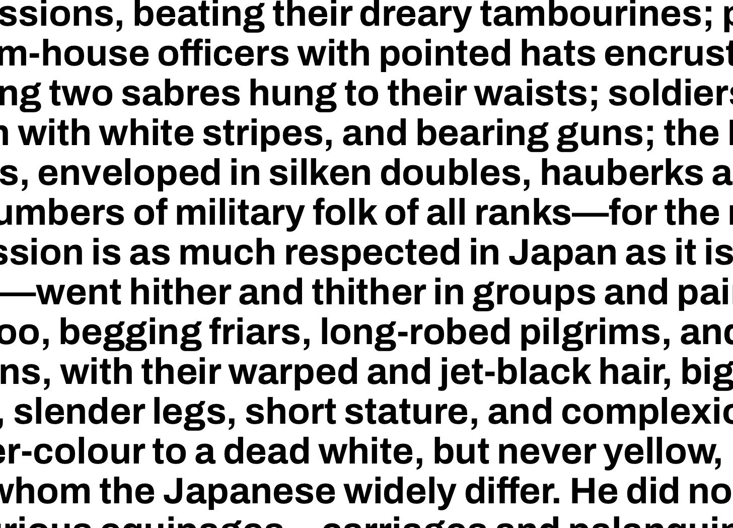
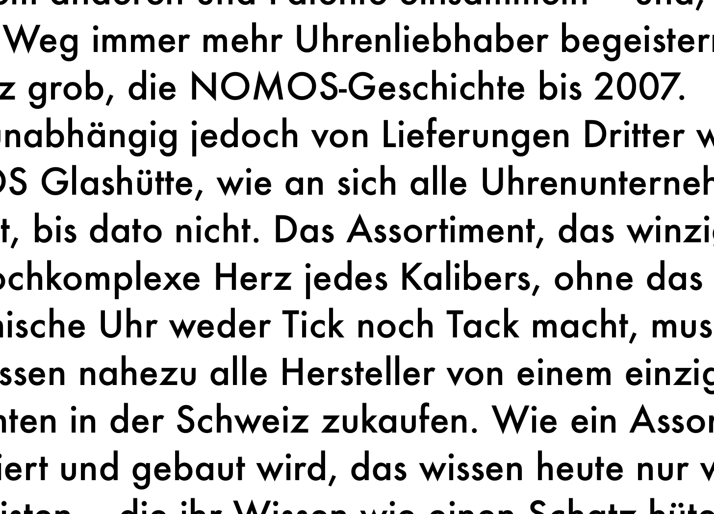

It seems like you’re looking for more out of right-wing America than they could ever muster. The GOP and the right more broadly have become a purely reactionary movement. They don’t exist to “innovate” or to encourage creativity. There will never be a moment of artistic efflorescence rooted in reactionary feeling. The goal of a reactionary political & economic leadership is to make normal folks impoverished and subservient for the aggrandizement of the leader and his small gang of sycophants. The impulse of reactionary followers is seek permission from the leadership to be the worst version of themselves; the ugliness of this impulse and the catastrophe it always portends is disguised by a fantasy version of a past that the movement’s adherents love to talk about, but will never achieve. Any rationalization, however incoherent, is better than having to take responsibility for yourself. Reactionary movements are stupid and aesthetically malignant. The MAGA movement that has taken over our politics is especially stupid and aesthetically malignant.
If you want something aesthetically and culturally new and interesting and forward-looking, all you should want from politics is a basic defense of liberalism in government institutions and in the political economy. For the rest of it, you have the blank page of your life stretching before you and it’s up to you to fill it. Socially, maybe you’ll get a chance to share it with others who understand. For myself, I don’t know about anybody else, but that’s what I’m up to.
no, for a very practical reason.
custom fonts takes up too much space to load, and Helevtica and it’s derivatives are often preinstalled
that said, there is a lot of system fonts and font stacks
https://modernfontstacks.com/